Color Theory for Games: Visual Design Psychology
Have you ever been completely captivated by a game's world, feeling a sense of dread in a shadowy dungeon or exhilaration in a sun-drenched field? It's more than just graphics; it's the psychology of color at play, subtly influencing your emotions and guiding your experience.
Many game developers, especially those just starting out, struggle with creating truly immersive and engaging visuals. They understand the technical aspects, but often find it difficult to leverage color effectively to create the desired mood, guide the player's eye, and enhance the overall gameplay experience. The result? Games that feel visually flat, uninspired, or even confusing.
This guide will help you understand and implement color theory principles in your game design process. We will explore how different colors evoke specific emotions, how to create harmonious color palettes, and how to use color to improve gameplay clarity and player engagement.
We'll dive into the fundamentals of color theory, exploring how colors interact and affect our emotions. You'll learn to build palettes that enhance your game's atmosphere and guide player attention. We'll uncover secrets of color psychology and how to leverage it to deepen player engagement. Whether you're a seasoned developer or just beginning your journey, this guide is your key to unlocking the power of color in game design. Keywords covered include color palettes, visual design, game design, color psychology, user interface, user experience, and visual communication.
The Psychology of Color in Games
Color isn't just about aesthetics; it's a powerful tool that can directly impact a player's emotions and behavior. Think about the color red: it's often associated with danger, urgency, or aggression. Game designers might use it to highlight an enemy's attack, warn players about low health, or create a sense of tension. I recall playing a survival horror game where the screen slowly bled red as my character's sanity deteriorated. The visual cue, combined with the eerie sound design, amplified the feeling of helplessness and dread. It wasn't just a visual effect; it was a psychological manipulation that deepened my immersion in the game.
Now, consider the calming effect of blue. Blue is often associated with peace, tranquility, and intelligence. It can be used to create a sense of serenity in open-world games, to signify safe zones, or to convey a character's wisdom and knowledge. The key is understanding these associations and using them intentionally to create the desired emotional response in your players. This goes beyond simply choosing colors that look pretty.It's about using color as a language to communicate with your audience on a subconscious level. Understanding the cultural associations of different colors is also crucial, as they can vary greatly across different regions and demographics. Effective use of color psychology can elevate your game from a simple pastime to a truly engaging and memorable experience, impacting player retention and overall enjoyment.
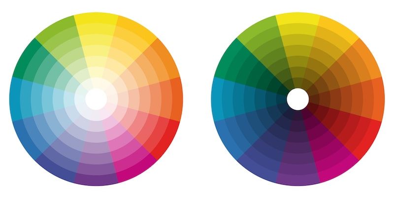
Understanding Color Harmonies
Color harmonies are established methods of combining colors to create visually appealing and balanced palettes. Monochromatic palettes, which use different shades and tints of a single hue, can create a sense of unity and simplicity. Analogous palettes, which feature colors adjacent to each other on the color wheel, offer a harmonious and calming feel. Complementary palettes, which combine colors opposite each other on the color wheel, create high contrast and visual excitement. Triadic palettes, which use three colors equally spaced on the color wheel, offer a balanced and vibrant feel.
Choosing the right color harmony is crucial for setting the overall tone and mood of your game. A stealth game, for example, might benefit from a monochromatic palette of dark blues and greens to create a sense of secrecy and shadows. An action-packed fighting game, on the other hand, might use a complementary palette of reds and blues to create a dynamic and energetic visual experience. Experimenting with different color harmonies and understanding their effects on the viewer can significantly enhance the visual appeal and impact of your game. Beyond the basic harmonies, exploring variations like split-complementary or tetradic palettes can add further nuance and depth to your color choices.
The History and Myths of Color Theory
Color theory, while seemingly modern, has roots stretching back centuries. Thinkers like Aristotle and Leonardo da Vinci pondered color's nature, but it was Sir Isaac Newton's prism experiments that truly laid the groundwork. He demonstrated that white light could be separated into a spectrum of colors, forming the basis of the color wheel we use today. Over time, artists and scientists refined these ideas, leading to the color models and harmonies we employ in game design.
One common myth is that certain color combinations are universally appealing. In reality, color preferences are heavily influenced by culture, personal experiences, and even age. A color palette popular in one region might be perceived as garish or unappealing in another. Another myth is that all colors have fixed meanings. While certain associations are common (red for danger, blue for calm), context is key. The same color can evoke different emotions depending on the game's genre, setting, and narrative. Understanding the historical development of color theory helps us appreciate its evolution, while debunking common myths allows us to use color more thoughtfully and effectively in our designs. Knowing the limitations of hard-and-fast rules about color ensures that you cater to your game's target audience with greater nuance and understanding.
Hidden Secrets of Color Theory
Beyond the basics of color wheels and harmonies, there are subtle techniques that can elevate your color usage. Consider the concept of simultaneous contrast: the way a color appears can change depending on the colors surrounding it. A grey patch will appear lighter against a dark background and darker against a light background. This effect can be used to create visual illusions, emphasize certain elements, and guide the player's eye. Another secret lies in understanding the psychological impact of saturation and value. Highly saturated colors tend to be more exciting and attention-grabbing, while desaturated colors can create a sense of calm or melancholy. Value, or the lightness or darkness of a color, can be used to create depth, contrast, and visual hierarchy.
Mastering these subtle techniques allows you to create more sophisticated and impactful visual designs. Experiment with different color combinations and observe how they affect each other. Pay attention to the saturation and value of your colors and how they contribute to the overall mood and atmosphere of your game. By understanding these hidden secrets, you can unlock the full potential of color and create truly memorable and engaging visual experiences. It also helps to consider how colorblindness affects different players. Including options to adjust the color palette can greatly improve accessibility and player enjoyment.
Recommendations for Color Theory in Games
Start by defining the mood and atmosphere you want to create in your game. Is it dark and suspenseful? Bright and cheerful? Use your understanding of color psychology to select a primary color that reflects this mood. Next, choose a color harmony that complements your primary color and creates visual balance. Don't be afraid to experiment with different palettes until you find one that feels right. Use color to guide the player's eye and create visual hierarchy. Highlight important elements with brighter, more saturated colors, and use desaturated colors for background elements.
Pay attention to the cultural associations of different colors and tailor your palette to your target audience. Consider the genre of your game and how color is typically used in that genre. Finally, get feedback from other developers and players on your color choices. Another recommendation is to use color palettes found in nature as inspiration. Studying the colors found in forests, deserts, or oceans can help you create realistic and visually appealing environments. Remember, color is a powerful tool that can enhance your game in many ways. Use it wisely and creatively to create a memorable and engaging experience for your players. Look to successful games within your genre for inspiration, but don't be afraid to innovate and develop your own unique visual style.
Color Accessibility in Games
A crucial, often overlooked aspect of color theory in game design is accessibility. Not everyone experiences color in the same way. Color blindness, or color vision deficiency (CVD), affects a significant portion of the population, making it difficult to distinguish between certain colors. This can have a significant impact on gameplay, especially if color is used to convey important information, such as enemy health or puzzle clues. To address this issue, it's essential to design your game with color blindness in mind. Avoid relying solely on color to communicate information. Use alternative cues, such as shapes, patterns, or text labels, to supplement your color choices.
There are different types of color blindness, each affecting the perception of different colors. Protanopia and deuteranopia affect the perception of red and green, while tritanopia affects the perception of blue and yellow. Testing your game with color blindness simulators can help you identify potential problem areas. There are many freely available online tools and software that can simulate different types of color blindness, allowing you to see how your game looks to players with CVD. Consider including colorblindness options in your game's settings, allowing players to customize the color palette to better suit their individual needs. Offering options like swapping red and green or using a grayscale mode can greatly improve accessibility and player enjoyment. Ultimately, designing with color accessibility in mind not only makes your game more inclusive but also forces you to think more creatively about visual communication.
Tips and Tricks for Using Color
Don't be afraid to experiment! Color theory is a science, but it's also an art. Try different color combinations, palettes, and techniques until you find what works best for your game. Use a color palette generator. There are many free online tools that can help you create harmonious color palettes based on your chosen mood or style. Pay attention to the contrast between colors. High contrast can be used to draw attention to important elements, while low contrast can create a more subtle and calming effect.
Use color to tell a story. Colors can be used to represent different characters, factions, or themes in your game. For example, a villainous character might be associated with dark, ominous colors, while a heroic character might be associated with bright, uplifting colors. Consider the lighting in your game. Lighting can have a significant impact on how colors appear. Experiment with different lighting conditions to see how they affect your palette. Get feedback from other developers and players on your color choices. Fresh eyes can often spot issues that you might have missed. Remember that color is just one element of visual design. It should work in harmony with other elements, such as typography, layout, and animation, to create a cohesive and engaging experience.
Common Color Mistakes to Avoid
One of the most common mistakes is using too many colors. A cluttered color palette can be overwhelming and distracting for the player. Stick to a limited number of colors and use them consistently throughout your game. Another mistake is ignoring color contrast. If the colors in your game are too similar, it can be difficult for players to distinguish between them, especially for players with color blindness. Make sure there is enough contrast between foreground and background elements to ensure readability and clarity.
Using colors that clash can also be a problem. Certain color combinations can be visually jarring and unpleasant. Use a color wheel or palette generator to find harmonious color combinations. Relying solely on personal preference is another pitfall. While it's important to express your own artistic vision, it's also important to consider the psychology of color and how it will affect your players. Testing your color choices with a diverse group of players is essential. Ignoring the cultural context of color can also lead to unintentional misunderstandings. Certain colors have different meanings in different cultures, so it's important to be aware of these nuances. Avoid using default color palettes. These palettes are often generic and uninspired. Take the time to create a custom palette that reflects the unique style and mood of your game. Remember, color is a powerful tool, but it must be used thoughtfully and intentionally to be effective.
Fun Facts About Color in Games
Did you know that the use of color in video games was initially limited by technology? Early games often used a limited palette of only a few colors due to hardware constraints. This limitation actually led to some creative solutions, with developers using dithering and other techniques to create the illusion of more colors than were actually available. The iconic color palettes of games like Pac-Man and Space Invaders were not simply aesthetic choices; they were technological necessities.
Another fun fact is that color can be used to influence player behavior in subtle ways. Studies have shown that players are more likely to take risks in games with warmer color palettes (reds, oranges, yellows) and more likely to play cautiously in games with cooler color palettes (blues, greens, purples). The color of the user interface can also affect player performance. A well-designed UI with clear color cues can improve reaction time and reduce errors. The use of color in advertising for games is also fascinating. Game developers often use bright, saturated colors to attract attention and create excitement, while more sophisticated games may use more muted and nuanced palettes to appeal to a more discerning audience. Understanding these fun facts can give you a deeper appreciation for the role of color in game design and its impact on the player experience.
How to Create a Color Palette for Your Game
Start by defining the overall mood and tone of your game. What kind of emotions do you want to evoke in the player? Do you want them to feel excited, scared, relaxed, or something else? Use these emotions as a starting point for choosing your primary color. Next, consider the genre of your game. Different genres often have different color conventions. For example, horror games often use dark, muted colors, while fantasy games often use bright, vibrant colors.
Once you have a primary color and a genre in mind, you can start experimenting with different color harmonies. Use a color wheel or palette generator to find colors that complement your primary color and create visual balance. Consider the contrast between colors. Make sure there is enough contrast between foreground and background elements to ensure readability and clarity. Test your palette with different lighting conditions. Lighting can have a significant impact on how colors appear. Finally, get feedback from other developers and players on your color choices. Fresh eyes can often spot issues that you might have missed. There are many online resources and tools that can help you with color palette creation, such as Adobe Color, Coolors, and Paletton. Don't be afraid to iterate on your palette until you find one that perfectly captures the mood and style of your game.
What if You Ignore Color Theory?
Ignoring color theory in game design can lead to a variety of problems, from visual clutter and confusion to a lack of emotional impact and player engagement. A poorly chosen color palette can make your game look amateurish and unpolished, potentially turning off potential players. Without a clear understanding of color harmonies and contrast, your game may suffer from visual fatigue, making it difficult for players to focus and enjoy the experience.
Important information may be missed if color contrast is low, especially by players with color blindness. This can lead to frustration and a negative gameplay experience. A lack of color psychology can also undermine the mood and atmosphere of your game. If the colors don't align with the intended emotions, the game may feel disjointed and unconvincing. In extreme cases, ignoring color theory can even make your game unplayable. If the colors are too jarring or distracting, players may be unable to focus on the gameplay and may quickly become bored or frustrated. While breaking the rules of color theory can sometimes lead to interesting and innovative visual styles, it's important to understand the rules before you break them. A solid understanding of color theory provides a foundation for making informed design decisions and creating visually compelling and engaging games. Ultimately, a strong visual design is essential for attracting and retaining players, and color plays a crucial role in achieving that goal.
Listicle: Top 5 Color Mistakes in Game Design
1. Overusing Saturated Colors: While bright colors can be exciting, too many saturated colors can be overwhelming and fatiguing for the eyes. Use saturated colors sparingly to highlight important elements and balance them with more muted tones.
- Ignoring Color Contrast: Low color contrast can make it difficult to distinguish between foreground and background elements, leading to readability issues and eye strain. Ensure sufficient contrast between colors to improve clarity and accessibility.
- Relying Solely on Color to Convey Information: Players with color blindness may have difficulty distinguishing between certain colors, making it essential to use alternative cues, such as shapes, patterns, or text labels, to supplement color choices.
- Neglecting the Cultural Context of Color: Different colors have different meanings in different cultures, so it's important to be aware of these nuances when designing your game. Research the cultural associations of colors to avoid unintentional misunderstandings.
- Failing to Test Your Palette: Before releasing your game, test your color palette with a diverse group of players to identify any potential issues. Use color blindness simulators to see how your game looks to players with CVD. By avoiding these common color mistakes, you can create visually appealing and accessible games that resonate with a wider audience. Remember, color is a powerful tool that can enhance the player experience, but it must be used thoughtfully and intentionally.
Question and Answer About Color Theory for Games
Q: What is the most important aspect of color theory in game design?
A: The most important aspect is understanding how color affects emotions and using that knowledge to create the desired mood and atmosphere in your game.
Q: How can I make my game more accessible to players with color blindness?
A: Avoid relying solely on color to convey information. Use alternative cues, such as shapes, patterns, or text labels, to supplement your color choices. Consider including colorblindness options in your game's settings, allowing players to customize the color palette.
Q: What are some good resources for learning more about color theory?
A: There are many online resources and books available. Some popular resources include Adobe Color, Coolors, Paletton, and books like "Interaction of Color" by Josef Albers.
Q: How can I choose the right color palette for my game?
A: Start by defining the mood and tone of your game. Consider the genre of your game and the cultural associations of different colors. Use a color wheel or palette generator to find harmonious color combinations. Test your palette with different lighting conditions and get feedback from other developers and players.
Conclusion of Color Theory for Games
In conclusion, color theory is an essential tool for game developers looking to create visually engaging and emotionally resonant experiences. By understanding the principles of color psychology, color harmonies, and accessibility, you can elevate your game design and create a truly memorable experience for your players. Don't be afraid to experiment, learn from your mistakes, and seek feedback from others. With practice and dedication, you can master the art of color and unlock its full potential in your game development journey.
Post a Comment